Overlay as a Visual Debugging Tool
The overlay modifier can add all sorts of visual information to a view, without impacting its layout. Here are some examples of its versatility as a debugging tool.
Debugging tools
If you have spent any time working with SwiftUI, you have probably reached a situation where a view is laying out in an unexpected manner, some padding looks off, or the alignments are misbehaving. One of the most fundamental tools for adding a visual indicator to a specific view is the handy border modifier, which will draw a border around any view, handy for outlining its actual frame:
1
2
3
4
5
6
7
8
9
10
11
12
HStack(spacing: .zero) {
    Circle().fill(.gray.tertiary)
    Circle().fill(.green)

    Circle().fill(.mint)
    .frame(width: 120, height: 100)
    .border(.red.secondary, width: 4) // Highlight the frame of this view.

    Circle().fill(.teal)
    Circle().fill(.gray.tertiary)
}
.padding(.horizontal)
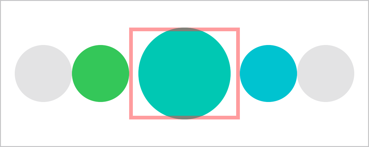
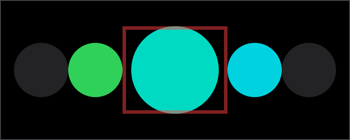
The border modifier works well as visual debugging for two reasons: it adds a visual indicator, and it does not modify the layout of the owner view. The original layout is kept intact both internally (the sub-views contained by the owner view), and externally (the space the owner view occupies in its parent layout). This orthogonality is important in a debugging tool: it modifies one aspect (adds a visual adornment) while not modifying another aspect (the layout of the views).
The debug tool orthogonality is also present in another modifier that turns out to be extremely versatile: overlay. Using it we can add all sorts of visual information without impacting the original layout of the views we are debugging. Here are some interesting features of overlay and how it can be used as a debug tool for SwiftUI views.
Layout is never modified
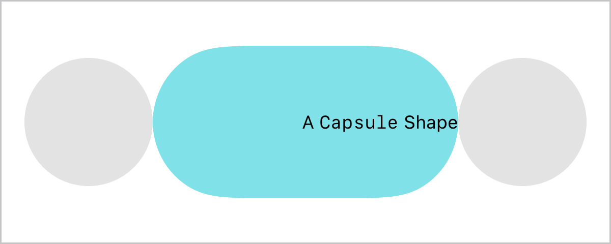
It is worth repeating the most important feature of this modifier: adding an overlay will never change the layout space the owner view occupies. This means it can always be added as a non-destructive layout operation. At its most basic it can be used to label and keep track of a view:
1
2
3
4
5
6
7
8
9
10
11
12
13
14
HStack(spacing: .zero) {
    Circle().fill(.gray.tertiary)

    Capsule()
    .fill(.teal.secondary)
    .frame(width: 200, height: 100)
    .overlay(alignment: .trailing) { // Label this view.
        Text("A `Capsule` Shape")
        .font(.caption)
    }

    Circle().fill(.gray.tertiary)
}
.padding(.horizontal)
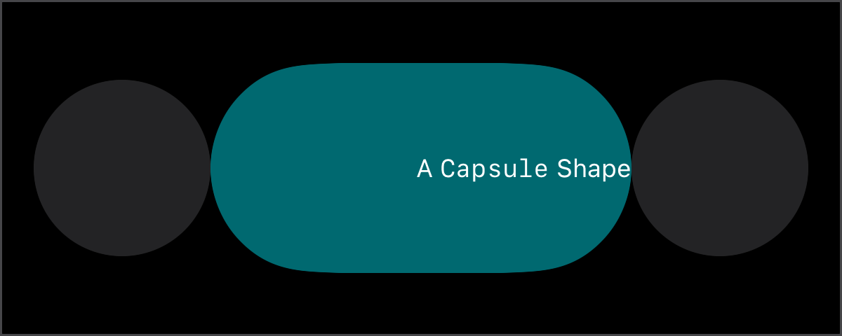
Overlay content size
The content in an overlay is always framed to the size of the owner view, an expanding view will grow to this exact size. For example, adding a Rectangle in an overlay reproduces the same behavior as the border modifier:
1
2
3
4
5
6
7
8
9
10
11
12
13
14
HStack(spacing: .zero) {
    Circle().fill(.gray.tertiary)

    Capsule()
    .fill(.teal.secondary)
    .frame(width: 200, height: 100)
    .overlay(alignment: .trailing) { // Border this view.
        Rectangle()
        .strokeBorder(.red.secondary, lineWidth: 4)
    }

    Circle().fill(.gray.tertiary)
}
.padding(.horizontal)
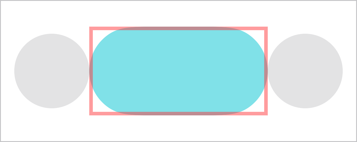
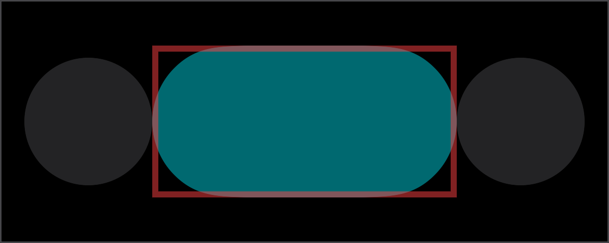
Mix this with a GeometryReader and it can print geometry information about any view! Note that since the content in overlay is framed to the size of the owner view (the Capsule), text will adapt to the available size by wrapping around:
1
2
3
4
5
6
7
8
9
10
11
12
13
14
15
16
17
18
19
HStack(spacing: .zero) {
    Circle().fill(.gray.tertiary)

    Capsule()
    .fill(.teal.secondary)
    .frame(width: 200, height: 100)
    .overlay { // Print geometry of this view.
        GeometryReader { geometry in
            Text("""
                size: \(geometry.size.debugDescription)
                safeAreaInsets: \(String(describing:geometry.safeAreaInsets))
                """)
            .font(.caption.monospacedDigit())
        }
    }

    Circle().fill(.gray.tertiary)
}
.padding(.horizontal)
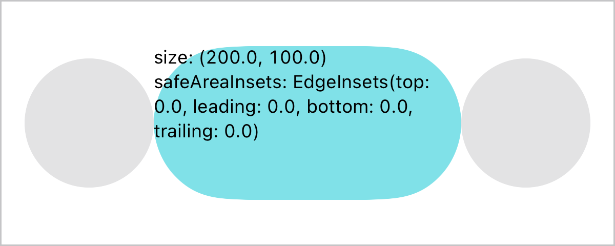
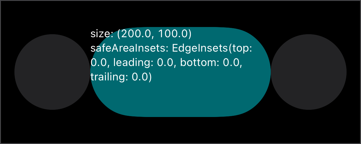
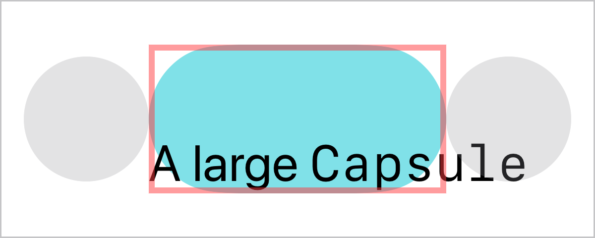
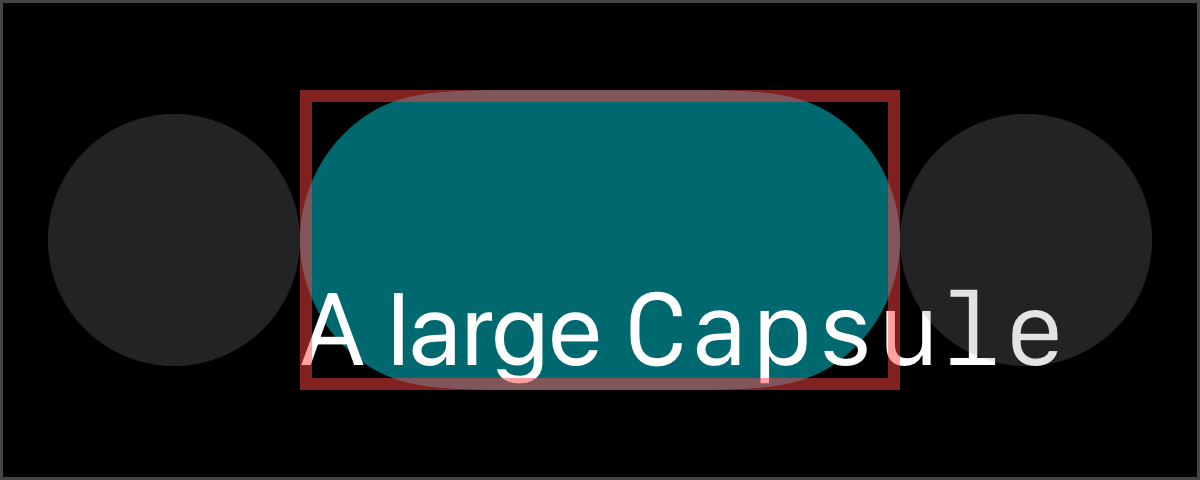
Any overlay content that is larger than the owner view will overflow while staying aligned to the overlay alignment. Even in these cases the original layout is still unchanged, notice the border still highlights only the Capsule frame:
1
2
3
4
5
6
7
8
9
10
11
12
13
14
15
16
HStack(spacing: .zero) {
    Circle().fill(.gray.tertiary)

    Capsule()
    .fill(.teal.secondary)
    .frame(width: 200, height: 100)
    .overlay(alignment: .bottomLeading) {
        Text("A large `Capsule`")
        .font(.largeTitle)
        .fixedSize() // Force the label to overflow.
    }
    .border(.red.secondary, width: 4) // Note the frame is still just the capsule.

    Circle().fill(.gray.tertiary)
}
.padding(.horizontal)
Alignment guides
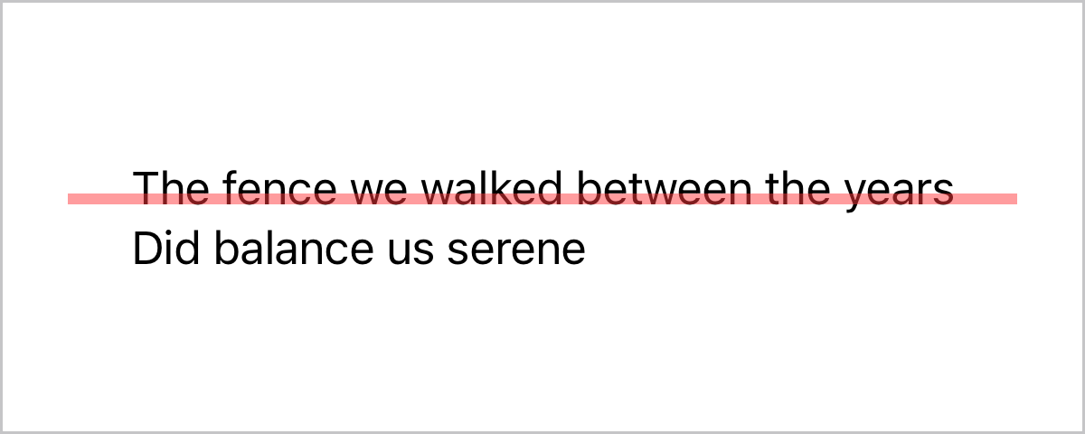
Alignment in an overlay is one of its most interesting aspects. The overlaid content is aligned to the guides of the owner view. This makes it possible to use overlay to add a visualization of any alignment guide, especially for views that offer additional alignments like firstTextBaseline:
1
2
3
4
5
6
7
8
9
10
Text("""
    The fence we walked between the years
    Did balance us serene
    """
)
.overlay(alignment: .centerFirstTextBaseline) {
    Rectangle()
    .fill(.red.secondary)
    .frame(width: 350, height: 4)
}
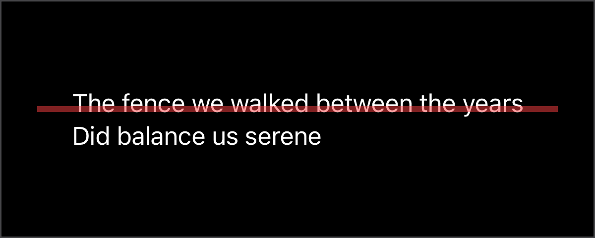
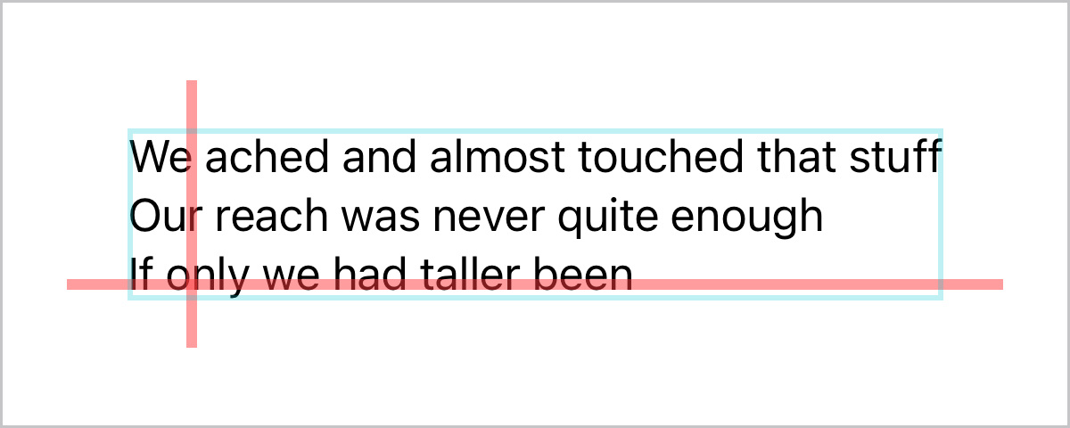
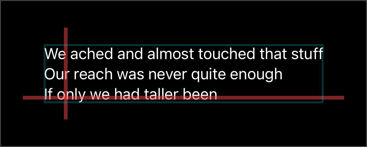
When views modify their alignment guides overlay uses that adjusted guide, so custom alignments can be easily tracked visually. Again note that the last border drawn shows that the resulting frame from the overlay modifier is still the size of just the original Text:
1
2
3
4
5
6
7
8
9
10
11
12
13
14
15
16
17
18
19
20
Text("""
    We ached and almost touched that stuff
    Our reach was never quite enough
    If only we had taller been
    """
)
.alignmentGuide(.leading) { dimensions in
    dimensions[.leading] + 22
}
.overlay(alignment: .centerLastTextBaseline) {
    Rectangle() // Last Baseline indicator.
    .fill(.red.secondary)
    .frame(width: 350, height: 4)
}
.overlay(alignment: .leading) {
    Rectangle() // Leading indicator.
    .fill(.red.secondary)
    .frame(width: 4, height: 100)
}
.border(.teal.tertiary, width: 2) // Note the frame is still just the text.
Floating content
And this brings us to my favorite surprise out of overlay, a product of how it handles its content and alignments: By modifying the alignment of the overlaid content it is possible to create floating content around the owner view. Debug visuals can then float outside of the debugged view, without blocking it at all:
1
2
3
4
5
6
7
8
9
10
11
RoundedRectangle(cornerRadius: 8)
.fill(.teal.gradient)
.stroke(.indigo.gradient, lineWidth: 4)
.frame(width: 100, height: 100)
.overlay(alignment: .trailingLastTextBaseline) {
    Text("A `RoundedRectangle`\nwith fill and stroke")
    .fixedSize()
    .font(.caption)
    .padding(.horizontal, 8)
    .alignmentGuide(.trailing) { $0[.leading] } // Floating alignment!
}
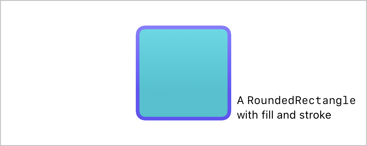
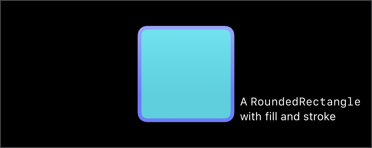
Floating content is particularly useful for creating illustrations for examples or documentation, where the example and the visual adornments can both live in the code.
1
2
3
4
5
6
7
8
9
10
11
12
13
14
15
16
17
18
19
20
21
22
23
24
25
26
27
Text("""
    In the green
    of leaf
    and promising
    of peach
    """
)
.font(.subheadline)
.padding(.horizontal, 4)
.frame(width: 160, height: 100, alignment: .trailing)
.background {
    RoundedRectangle(cornerRadius: 8).fill(.teal.secondary)
}
// Illustration adornments.
.overlay(alignment: .trailing) {
    HStack(spacing: 4) {
        Rectangle()
            .fill(.red.secondary)
            .frame(width: 2)
        Text("Notice `Text` multiline alignment defaults to `leading`")
            .font(.caption)
            .foregroundStyle(.secondary)
            .frame(width: 100, alignment: .leading)
    }
    .padding(.leading, 8)
    .alignmentGuide(.trailing) { $0[.leading] }
}
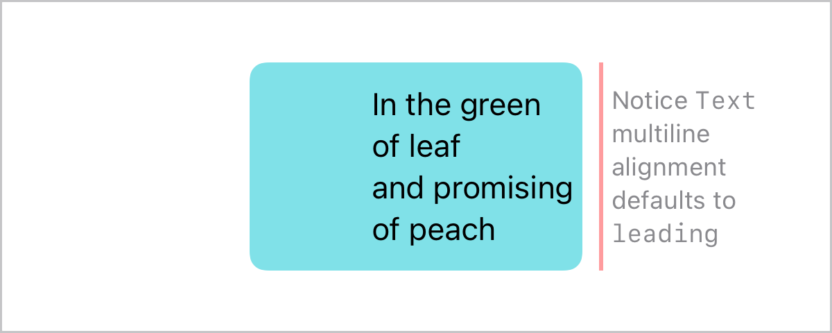
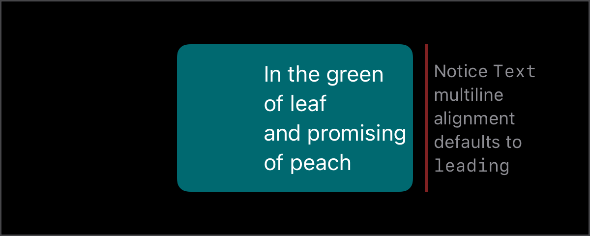 Example illustration along its own adornments.
Debug Overlay
All these overlay features became the basis for implementing DebugOverlayModifier, one of the main tools in the PreviewUtilities package. This modifier wraps a visualization of the view’s geometry all in a handy overlay, all ready to display with a single line:
1
2
3
4
5
6
7
// import PreviewUtilities
HStack(spacing: .zero) {
    Text("view")
    Text(".debugOverlay()")
        .debugOverlay(.size, .alignment(.outerBottomTrailing))
}
.monospaced()
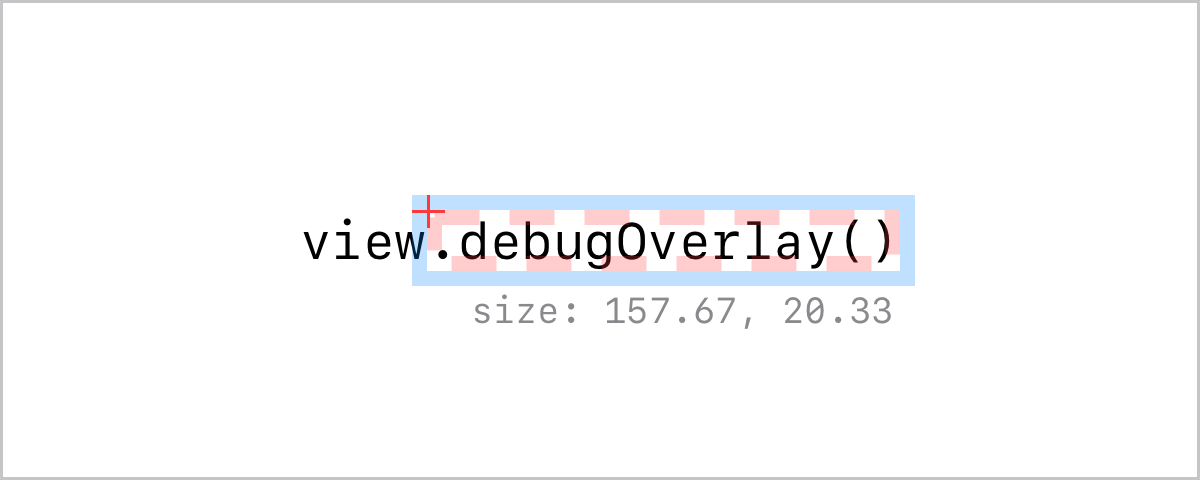
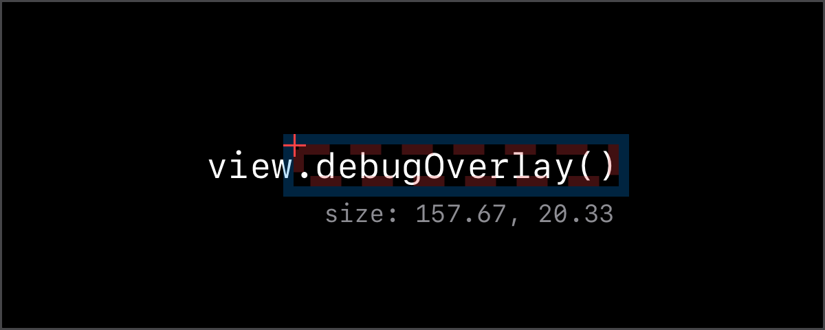
Use it to quickly add on your previews (or runtime) a visual to asses the geometry of any view, without messing with the layout. I have found it a fantastic tool, and it gave me a playful appreciation of the power of a humble overlay.
Visually debugging since 2003, when Macromedia Flash MX was released.