The Intricacies of Perfectly Circular Buttons
Since the release of the Glass appearance in Apple platforms, circular buttons have become commonplace in toolbars. However, creating a circular button anywhere else is not entirely straightforward.
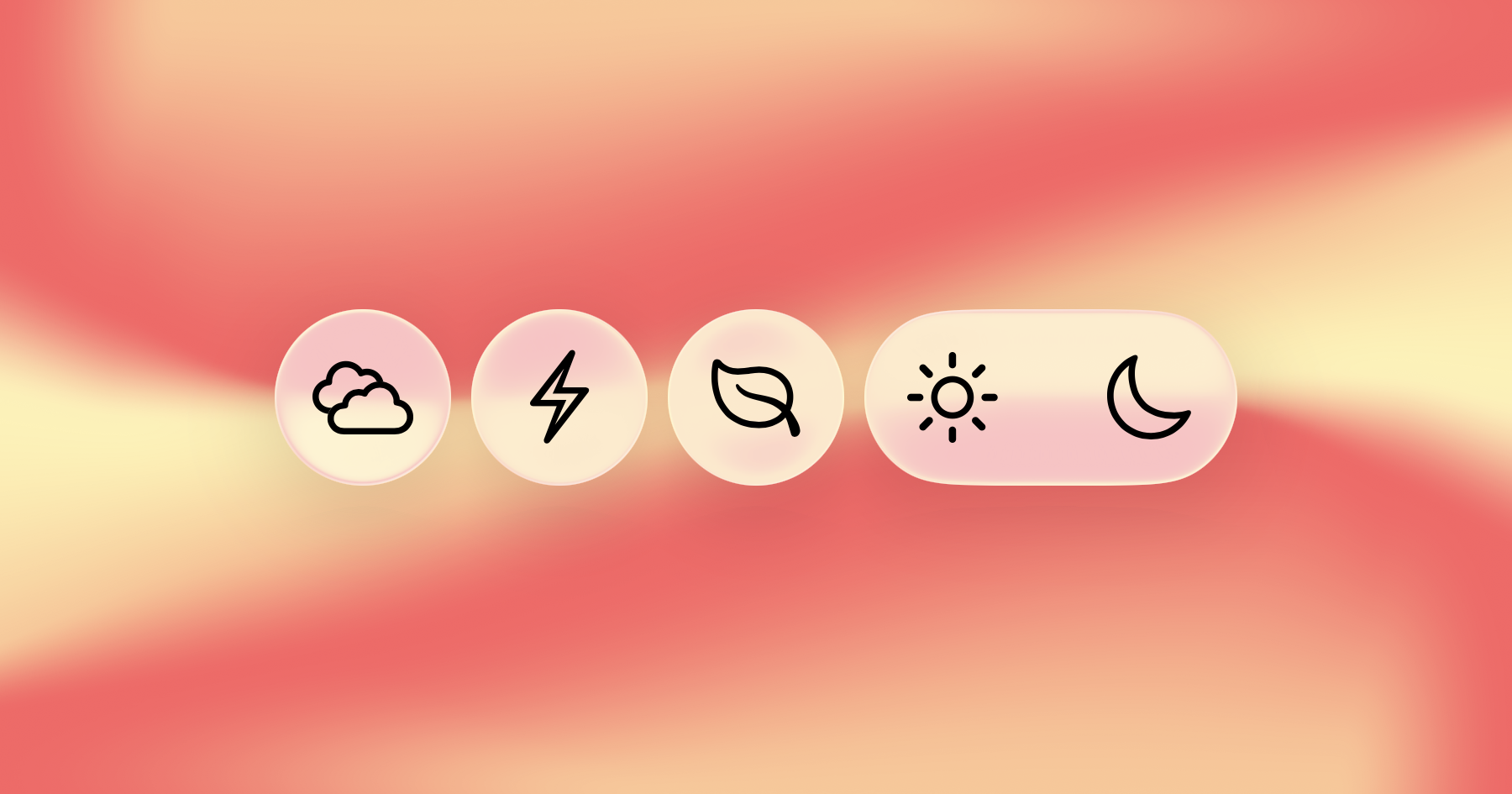
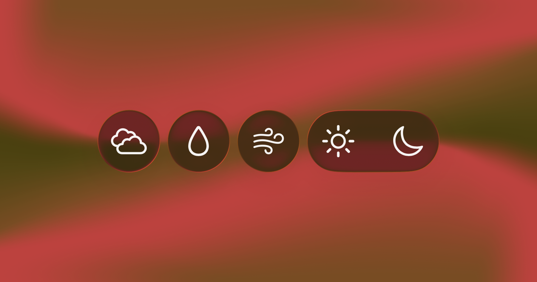
Framing Buttons
Since iOS 26, buttons placed in the toolbars automatically get a circular glass and icon-only appearance. Outside of the toolbars, the platform APIs seem to provide all the pieces necessary to make similar circular buttons: a glass button style, the iconOnly label style, the circle button border shape, and alternatively the glassEffect modifier with a shape. Upon using what seem like the obvious combinations, the results end up far from a usable circular button:
1
2
3
4
5
6
7
8
9
10
11
12
13
HStack {
    let mountainsButton = Button("Mountains", systemImage: "mountain.2", action: {})

    mountainsButton
    .labelStyle(.iconOnly)
    .buttonBorderShape(.circle)
    .buttonStyle(.glass)

    mountainsButton
    .labelStyle(.iconOnly)
    .glassEffect(.regular.interactive(), in: .circle)
}
.font(.title)
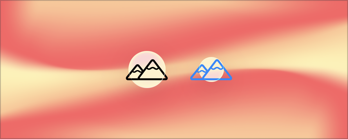
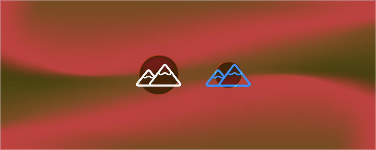
Using some borders around the Image shows that the size of the shape used for both buttons depends on the size of the image itself, with the shape fitting inside the space occupied by the button. This works well for the capsule shape, the default for bordered buttons, but ends up too small for the circle shape:
1
2
3
4
5
6
7
8
9
10
11
12
13
14
15
16
17
18
19
20
21
22
23
24
25
26
27
HStack {
    let mountainsButton = Button(action: {}) {
        Label { Text("Mountains") }
        icon: {
            Image(systemName: "mountain.2")
            .border(.mint.secondary, width: 4) // Outline symbol frame.
        }
    }

    mountainsButton
    .labelStyle(.iconOnly)
    .buttonBorderShape(.capsule)
    .buttonStyle(.glass)
    .border(.pink) // Outline button frame.

    mountainsButton
    .labelStyle(.iconOnly)
    .buttonBorderShape(.circle)
    .buttonStyle(.glass)
    .border(.pink) // Outline button frame.

    mountainsButton
    .labelStyle(.iconOnly)
    .glassEffect(.regular.interactive(), in: .circle)
    .border(.pink) // Outline button frame.
}
.font(.title)
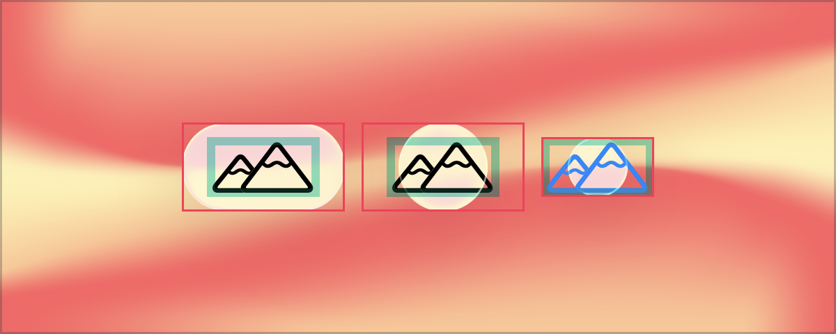
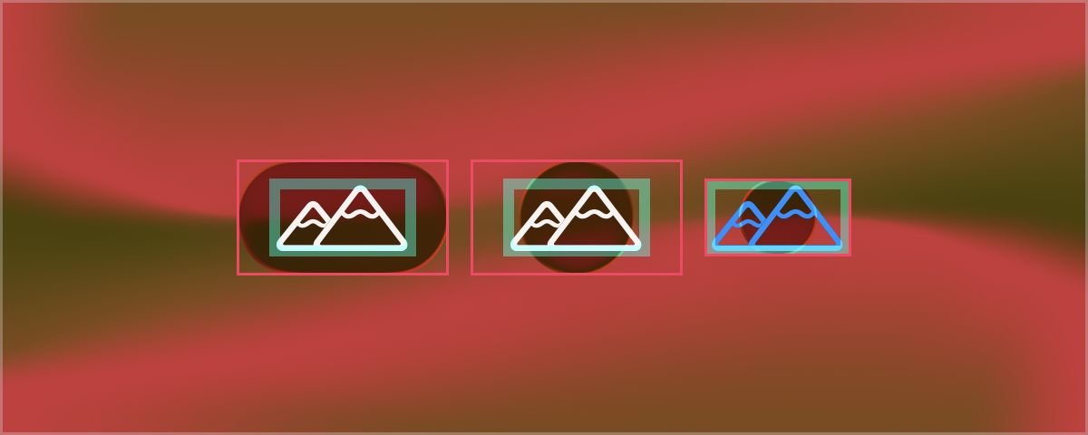
To properly use the circle shape, the button size needs to be a square, which is then fully filled by the circle. One approach could be to frame the Image view through the Button(action:label:) constructor as in the example above. However, for a more reusable approach, this is a good case for making a ButtonStyle that sets up the button with the desired configuration in a single go:
1
2
3
4
5
6
7
8
struct FramedButtonStyle: ButtonStyle {
    let length: CGFloat
    func makeBody(configuration: Configuration) -> some View {
        configuration.label
        .labelStyle(.iconOnly)
        .frame(width: length, height: length)
    }
}
Note that to make this style work, the glass effect is applied directly to the button. The buttonBorderShape modifier stops working because the style is not making use of ButtonBorderShape (an issue that will be revisited later) but the button still takes up a square that is properly filled by the glass circle:
1
2
3
4
5
6
7
8
9
10
11
HStack {
    Button("Leaf", systemImage: "leaf", action: {})
    .buttonStyle(FramedButtonStyle(length: 60))
    .buttonBorderShape(.circle)  // Does not work with this style!
    .border(.pink) // But the button frame is still a square.

    Button("Leaf", systemImage: "leaf", action: {})
    .buttonStyle(FramedButtonStyle(length: 60))
    .glassEffect(.regular.interactive(), in: .circle)
}
.font(.title)
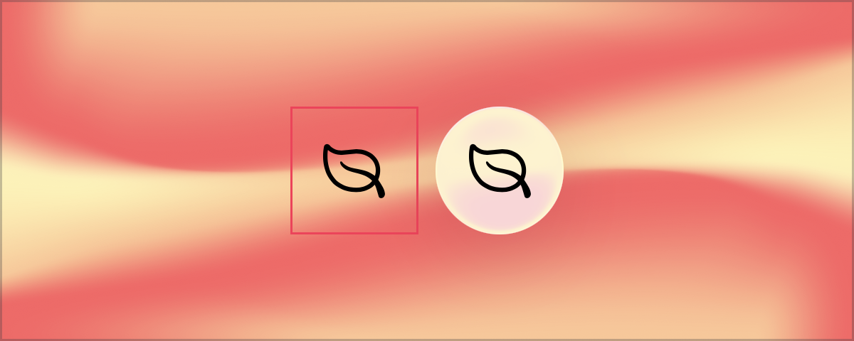
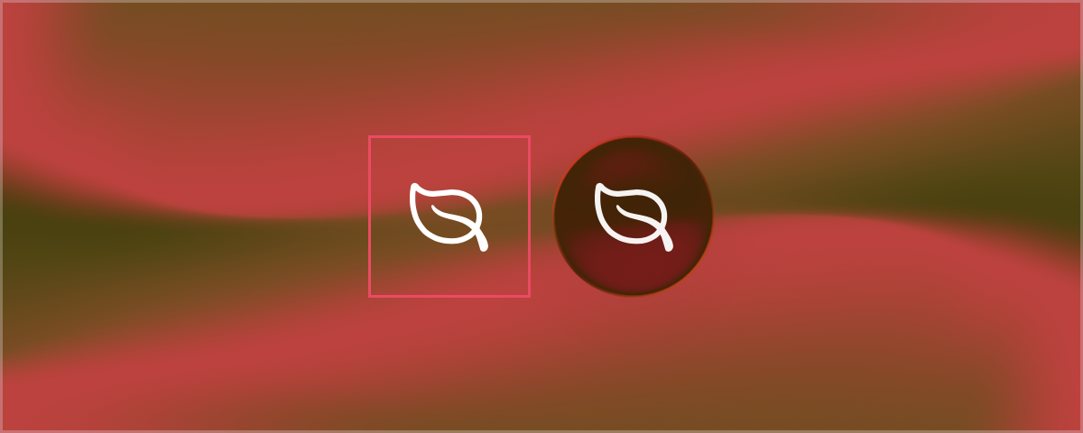
This is starting to look better! The glass effect can also be applied within the button style so that all affected buttons use the same effect. This approach seems like it could be enough until the style is applied to symbols with more odd shapes:
1
2
3
4
5
6
7
8
9
struct GlassFramedButtonStyle: ButtonStyle {
    let length: CGFloat
    func makeBody(configuration: Configuration) -> some View {
        configuration.label
        .labelStyle(.iconOnly)
        .frame(width: length, height: length)
        .glassEffect(.regular.interactive(), in: .circle)
    }
}
1
2
3
4
5
6
7
8
9
HStack {
    Button("Envelope",  systemImage: "envelope.badge.shield.half.filled", action: {})
    Button("Hourglass", systemImage: "hourglass.badge.plus", action: {})
    Button("Fish",      systemImage: "fish", action: {})
    Button("Car",       systemImage: "car.badge.gearshape", action: {})
    Button("Lock",      systemImage: "lock.open.trianglebadge.exclamationmark.fill", action: {})
}
.buttonStyle(GlassFramedButtonStyle(length: 60))
.font(.title)
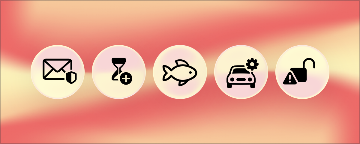
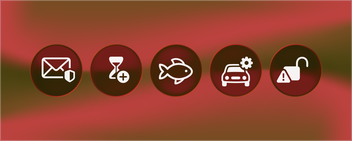
To help visualize the following examples, let’s define a handy View extension function to draw a specific alignment guide:
1
2
3
4
5
6
7
8
9
10
private extension View {
    func drawAlignmentGuide(_ verticalAlignment: VerticalAlignment, length: CGFloat? = nil) -> some View {
        let alignment = Alignment(horizontal: .center, vertical: verticalAlignment)
        return self.overlay(alignment: alignment) {
            Rectangle()
            .fill(.red.secondary)
            .frame(width: length, height: 2)
        }
    }
}
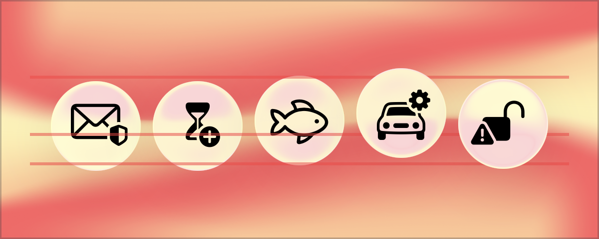
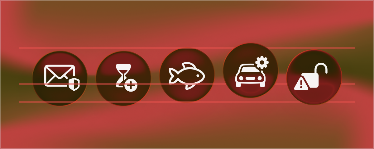
Back to the circle buttons, upon close inspection note that all the symbols with badges look slightly off-center vertically. Aligning all buttons to firstTextBaseline (and drawing the alignment guides) can show that the glass circles are drawn in slightly different positions:
1
2
3
4
5
6
7
8
9
10
11
12
13
14
HStack(alignment: .firstTextBaseline) {
    Button("Envelope",  systemImage: "envelope.badge.shield.half.filled", action: {})
    Button("Hourglass", systemImage: "hourglass.badge.plus", action: {})

    Button("Fish", systemImage: "fish", action: {})
    .drawAlignmentGuide(.top, length: 360)
    .drawAlignmentGuide(.firstTextBaseline, length: 360)
    .drawAlignmentGuide(.bottom, length: 360)

    Button("Car",  systemImage: "car.badge.gearshape", action: {})
    Button("Lock", systemImage: "lock.open.trianglebadge.exclamationmark.fill", action: {})
}
.buttonStyle(GlassFramedButtonStyle(length: 60))
.font(.title)
A Diversion: Inline Symbol Alignment
A detail about symbols and buttons that I find particularly well done: All system and custom symbols are defined around guidelines for the baseline and cap height of each font weight:
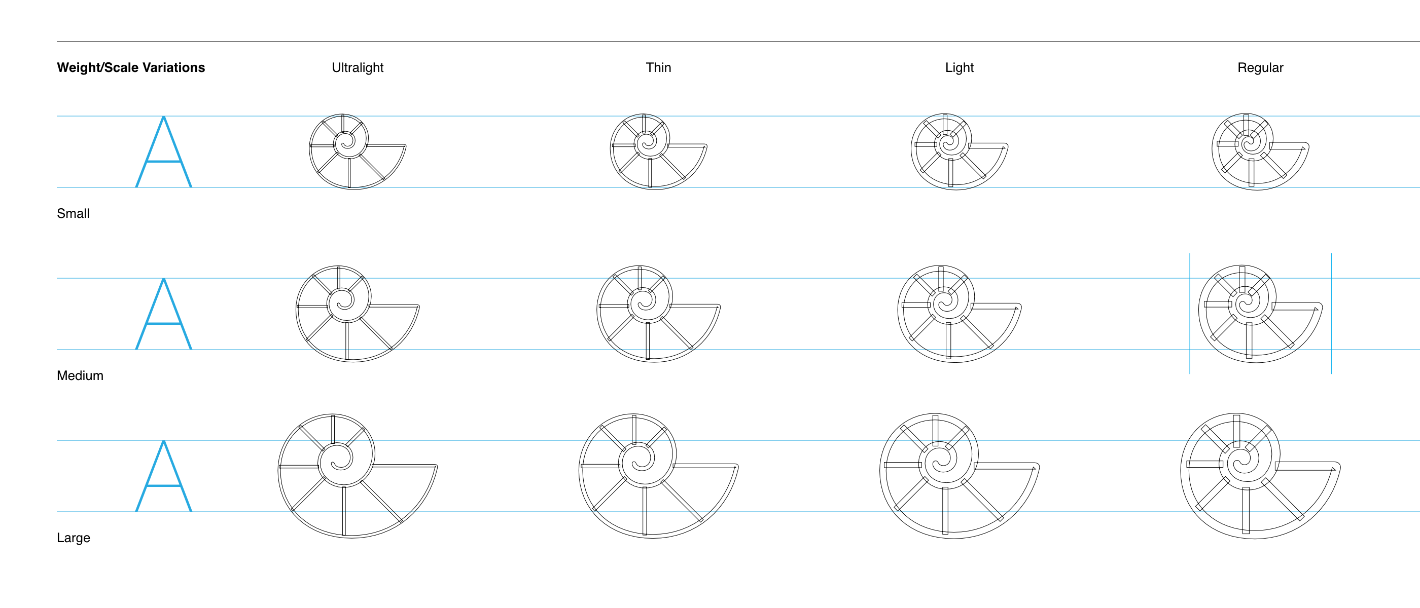 Part of the export file for the
 fossil.shell symbol.
This information is used to determine the symbol size and position relative to surrounding text, taking into account also font and image scale modifiers applied to the view hierarchy. When symbols are displayed along text, for example inline in Text or in buttons, their baseline alignment comes into play:
1
2
3
4
5
6
7
8
9
10
11
12
13
14
15
16
17
18
19
20
21
VStack {
    let envelope  = Image(systemName: "envelope.badge.shield.half.filled")
    let hourglass = Image(systemName: "hourglass.badge.plus")
    let shell     = Image(systemName: "fossil.shell")
    let car       = Image(systemName: "car.badge.gearshape")
    let lock      = Image(systemName: "lock.open.trianglebadge.exclamationmark.fill")
    Text("Regular \(envelope) \(hourglass) \(shell) \(car) \(lock) symbols")
    .drawAlignmentGuide(.firstTextBaseline)

    Text("Large \(envelope) \(hourglass) \(shell) \(car) \(lock) symbols")
    .imageScale(.large)
    .drawAlignmentGuide(.firstTextBaseline)

    HStack(alignment: .firstTextBaseline) {
        Button("Car", systemImage: "car.badge.gearshape", action: {})
        Button("Envelope", systemImage: "envelope.badge.shield.half.filled", action: {})
            .drawAlignmentGuide(.firstTextBaseline, length: 300)
        Button("Lock", systemImage: "lock.open.trianglebadge.exclamationmark.fill", action: {})
    }
}
.font(.title3)
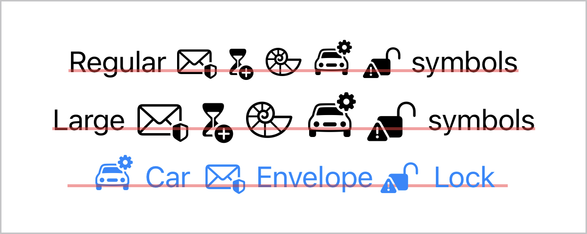
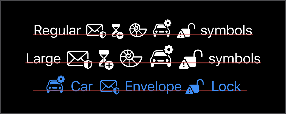
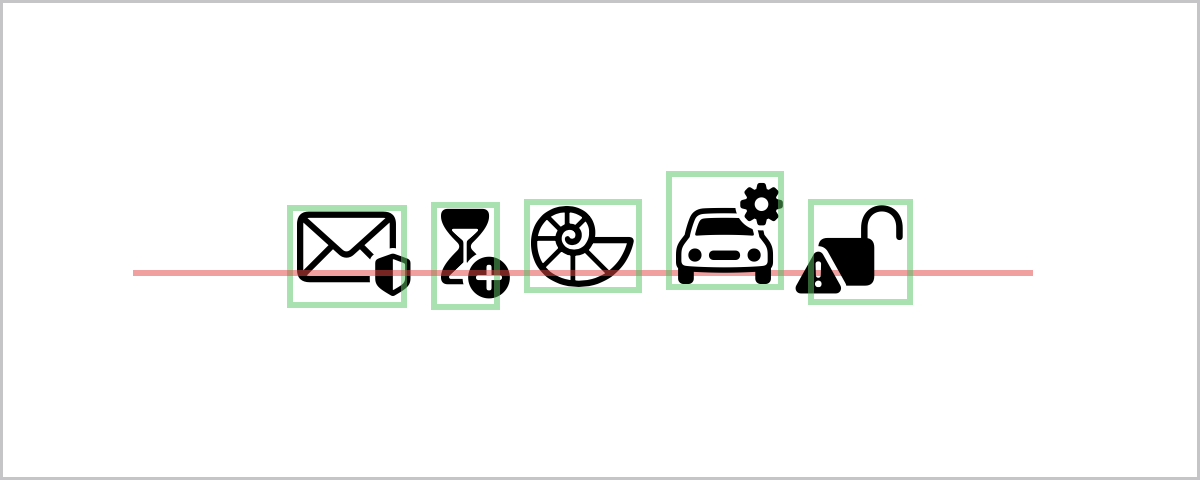
This means that symbols are expected to be aligned not by the raw size of their image but instead by their text baseline. The frame of the symbol sometimes even leaves parts outside in order to keep the symbol body horizontally centered:
1
2
3
4
5
6
7
8
9
10
11
12
13
14
HStack(alignment: .firstTextBaseline) {
    Image(systemName: "envelope.badge.shield.half.filled")
        .border(.green.secondary, width: 2)
    Image(systemName: "hourglass.badge.plus")
        .border(.green.secondary, width: 2)
    Image(systemName: "fossil.shell")
        .drawAlignmentGuide(.firstTextBaseline, length: 300)
        .border(.green.secondary, width: 2)
    Image(systemName: "car.badge.gearshape")
        .border(.green.secondary, width: 2)
    Image(systemName: "lock.open.trianglebadge.exclamationmark.fill")
        .border(.green.secondary, width: 2)
}
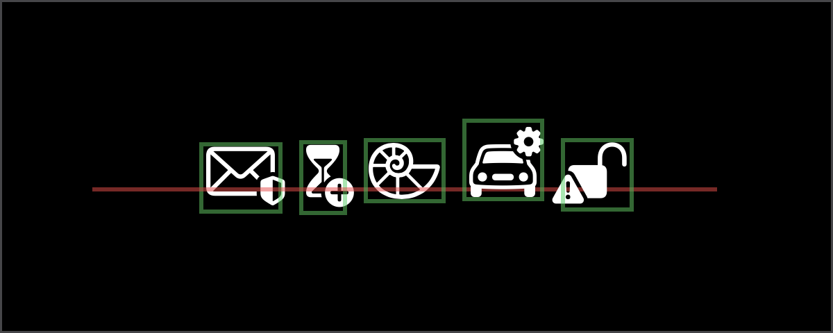
.font(.title)
Note that the badges of some symbols peek outside of the symbol boundaries.
Aligning by Baseline
Back to the circular buttons: an interesting issue here is how to align a symbol to a baseline if there is not text to provide said alignment. Buttons with the default styles do not deal with this because the button just takes the size of the symbol, which is the reason the default styles do not work well for circular buttons:
1
2
3
4
5
6
7
8
9
HStack(alignment: .firstTextBaseline) {
    Button("Horizontal", systemImage: "guidepoint.horizontal", action: {})
    Button("Vertical",   systemImage: "guidepoint.vertical", action: {})
    Button("Rainbow",    systemImage: "rainbow", action: {})
    Button("Bolt",       systemImage: "bolt", action: {})
}
.labelStyle(.iconOnly)
.buttonStyle(.glass)
.font(.title)
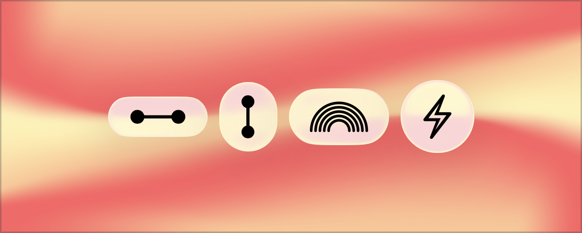
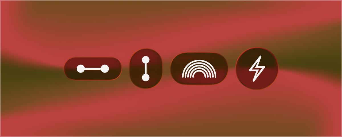
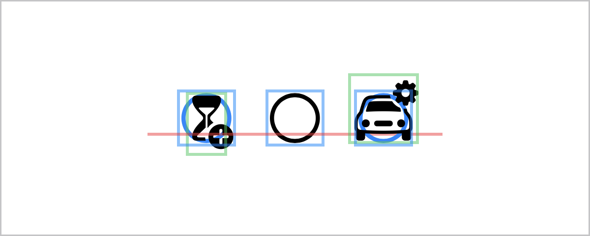
What is needed is a view that can be considered to already have a balanced size and provides a baseline alignment. Since symbols do provide a baseline alignment and the focus is circular buttons, one symbol might fit perfectly: circle! This placeholder symbol can be first centered in the circular button, and then the actual symbol aligned to it.
Enter the wonderful overlay modifier, with which the circle provides the layout frame and alignment guide for the overlaid button symbol:
1
2
3
4
5
6
7
8
9
10
11
12
13
14
15
16
17
18
19
20
21
22
HStack(alignment: .firstTextBaseline, spacing: 20) {
    Image(systemName: "circle")
        .foregroundStyle(.blue)
    .overlay(alignment: .centerFirstTextBaseline) {
        Image(systemName: "hourglass.badge.plus")
        .border(.green.secondary, width: 2)
    }
    .border(.blue.secondary, width: 2)

    Image(systemName: "circle")
    .border(.blue.secondary, width: 2) // Blue size frame is the same for all symbols!
    .drawAlignmentGuide(.firstTextBaseline, length: 200)

    Image(systemName: "circle")
    .foregroundStyle(.blue)
    .overlay(alignment: .centerFirstTextBaseline) {
        Image(systemName: "car.badge.gearshape")
        .border(.green.secondary, width: 2)
    }
    .border(.blue.secondary, width: 2)
}
.font(.largeTitle)
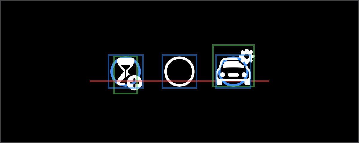
Even if each symbol has a different size (in green), the size used for layout is that of the circle symbol (in blue):
Baseline Button Style
Having figured out how to properly position the symbol in the center of another frame, this can be applied to an improved button style that now shows any symbol centered through its baseline:
1
2
3
4
5
6
7
8
9
10
11
12
13
struct GlassBaselinedButtonStyle: ButtonStyle {
    let length: CGFloat
    func makeBody(configuration: Configuration) -> some View {
        Image(systemName: "circle")
        .hidden() // The circle symbol is never visible, but its layout size remains.
        .overlay(alignment: .centerFirstTextBaseline) {
            configuration.label
            .labelStyle(.iconOnly)
        }
        .frame(width: length, height: length)
        .glassEffect(.regular.interactive(), in: .circle)
    }
}
1
2
3
4
5
6
7
8
9
10
11
12
13
14
HStack(alignment: .firstTextBaseline) {
    Button("Envelope",  systemImage: "envelope.badge.shield.half.filled", action: {})
    Button("Hourglass", systemImage: "hourglass.badge.plus", action: {})

    Button("Seashell", systemImage: "fossil.shell", action: {})
    .drawAlignmentGuide(.top, length: 360)
    .drawAlignmentGuide(.firstTextBaseline, length: 360)
    .drawAlignmentGuide(.bottom, length: 360)

    Button("Car",  systemImage: "car.badge.gearshape", action: {})
    Button("Lock", systemImage: "lock.open.trianglebadge.exclamationmark.fill", action: {})
}
.buttonStyle(GlassBaselinedButtonStyle(length: 60))
.font(.title)
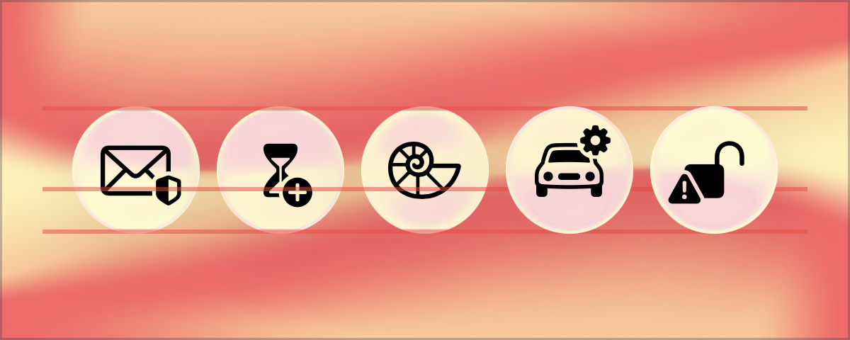
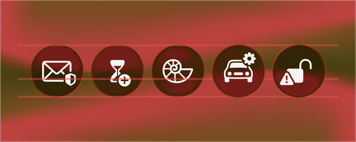
GlassBaselinedButtonStyle is at last a working button style that will consistently create circular icon-only buttons with the symbol properly centered in the middle of the button.
Label Style and Border Shapes
Some last improvements are still in order. As mentioned previously, these button styles do not work with ButtonBorderShape, since the border shape has to be applied explicitly by the button style in order to work.
But first, all the manipulation so far done in the button styles has been specifically to the label. A better and more reusable way to structure these modifications is to contain them in a LabelStyle instead:
1
2
3
4
5
6
7
8
9
10
11
struct BaselinedIconLabelStyle: LabelStyle {
    let length: CGFloat
    func makeBody(configuration: Configuration) -> some View {
        Image(systemName: "circle")
        .hidden()
        .overlay(alignment: .centerFirstTextBaseline) {
            configuration.icon
        }
        .frame(width: length, height: length)
    }
}
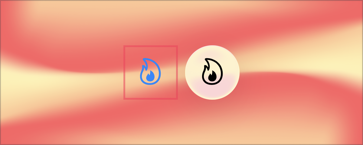
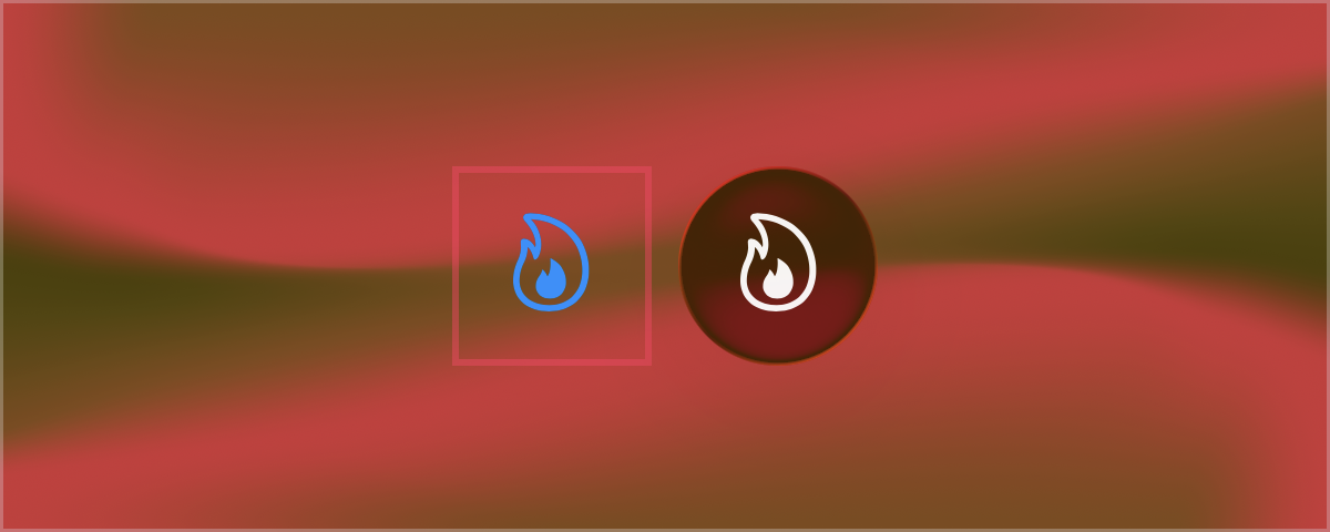
Same inner workings, but applied only to a label. On its own it can already achieve a proper circular button by pairing it with a glassEffect modifier, since the label takes care of providing the appropriate space for the circle shape. The glass effect does not even need to specify the circle shape because the default shape (capsule) is equivalent to a circle when filling a square:
1
2
3
4
5
6
7
8
9
10
11
HStack(alignment: .firstTextBaseline) {
    Button("Flame",  systemImage: "flame", action: {})
    .labelStyle(BaselinedIconLabelStyle(length: 60))
    .border(.pink.secondary, width: 2)

    Button("Flame",  systemImage: "flame", action: {})
    .labelStyle(BaselinedIconLabelStyle(length: 60))
    .buttonStyle(.plain) // To prevent button tint color.
    .glassEffect(.regular.interactive())
}
.font(.title)
With the label style in order, the final button style is only in charge of applying the glass effect style with the correct border shape:
1
2
3
4
5
6
struct GlassBorderedButtonStyle: ButtonStyle {
    func makeBody(configuration: Configuration) -> some View {
        configuration.label
        .glassEffect(.regular.interactive(), in: ButtonBorderShape.buttonBorder)
    }
}
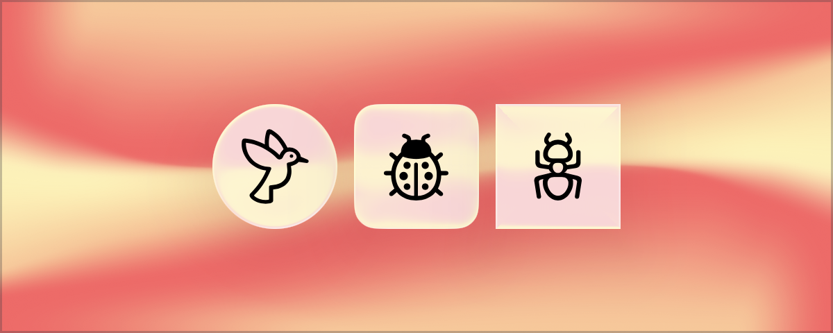
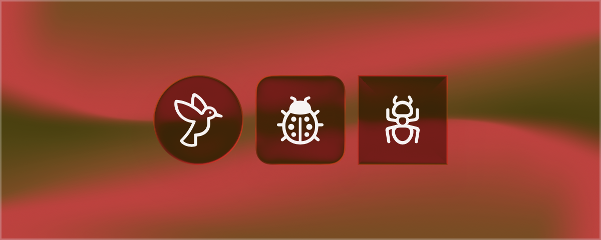
Now supporting ButtonBorderShape, the default capsule border shape will produce circular buttons with the configured labels. Other supported button shapes will also work appropriately with the glass effect:
1
2
3
4
5
6
7
8
9
10
11
12
13
14
15
16
HStack(alignment: .firstTextBaseline) {
    Button("Bird",  systemImage: "bird", action: {})
    .labelStyle(BaselinedIconLabelStyle(length: 60))
    .buttonStyle(GlassBorderedButtonStyle())

    Button("Ladybug",  systemImage: "ladybug", action: {})
    .labelStyle(BaselinedIconLabelStyle(length: 60))
    .buttonStyle(GlassBorderedButtonStyle())
    .buttonBorderShape(.roundedRectangle)

    Button("Ant",  systemImage: "ant", action: {})
    .labelStyle(BaselinedIconLabelStyle(length: 60))
    .buttonStyle(GlassBorderedButtonStyle())
    .buttonBorderShape(.roundedRectangle(radius: .zero))
}
.font(.title)
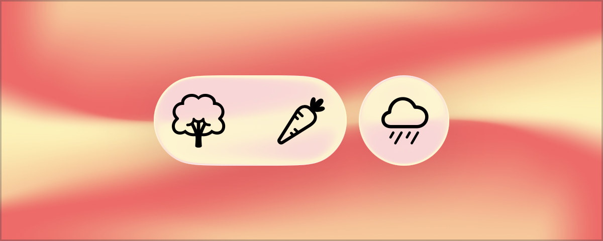
The last benefit of this separation of label and button styles is that by applying only the BaselinedIconLabelStyle, buttons retain the possibility of using specialized glass effects like glassEffectUnion to join several buttons into a shared glass effect:
1
2
3
4
5
6
7
8
9
10
11
12
13
14
15
16
17
18
19
20
21
22
// @Namespace var namespace

GlassEffectContainer {
    HStack(alignment: .firstTextBaseline) {
        Button("Tree", systemImage: "tree", action: {})
        .labelStyle(BaselinedIconLabelStyle(length: 60))
        .buttonStyle(.plain)
        .glassEffect(.regular.interactive())
        .glassEffectUnion(id: "union", namespace: namespace)

        Button("Carrot", systemImage: "carrot", action: {})
        .labelStyle(BaselinedIconLabelStyle(length: 60))
        .buttonStyle(.plain)
        .glassEffect(.regular.interactive())
        .glassEffectUnion(id: "union", namespace: namespace)

        Button("Rain", systemImage: "cloud.rain", action: {})
        .labelStyle(BaselinedIconLabelStyle(length: 60))
        .buttonStyle(GlassBorderedButtonStyle())
    }
    .font(.title)
}
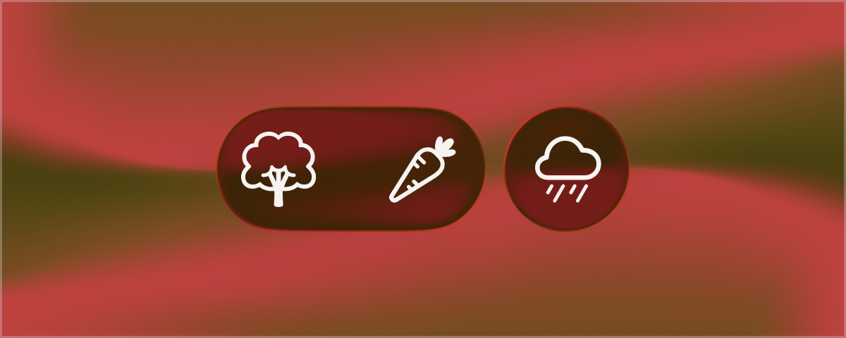
And with that all the possibilities for circular glass buttons were covered. The correct sizing of the buttons to fit precisely along system toolbars is left as an exercise to the reader. But at the very least, the symbols will be as perfectly centered as the system toolbar ones.
1
2
3
4
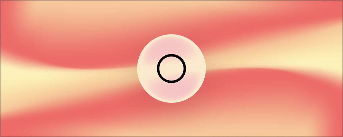
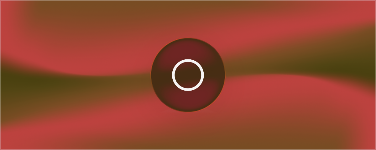
Button("Circle",  systemImage: "circle", action: {})
.labelStyle(BaselinedIconLabelStyle(length: 80))
.buttonStyle(GlassBorderedButtonStyle())
.font(.largeTitle)
Colophon
The code examples in this article were compiled using Swift 6.2.
Renderings using iPhone 17 Pro Simulator with iOS 26.5.
In support of buttons of all shapes and sizes.